Layout Guidelines
Designing the user experience is both art and science. Over decades of research, several important principles have emerged.
-
Check box and radio button labels must be included as part of the click target, making that target as big as possible.
-
Check box and radio button labels are usually to the right of the box or radio button.
A notable exception may be when they appear as part of a survey, in which case the label is on the left, and the series of rating radio buttons are on the right.
-
Actions associated with checked items in a grid should appear close to the column of check boxes.
This is usually on the “leading edge” of the grid (e.g., the left side for European languages).
-
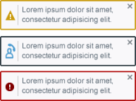
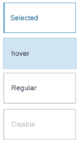
The visual design at rest should be calm and quiet. Subtle differences in state should be reflected with subtle visual cues. More prominent changes in state may use more prominent visual cues. Suggested examples:
-
Freshly rendered (calm and low contrast).
-
The hover state for all widgets with hover states.
-
The selected state.
-
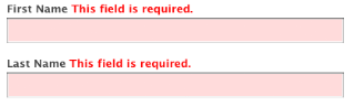
An error message, with the offending control highlighted.
-
A completion message.
-
A system notification.
-
-
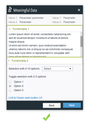
Labels on widgets should either be top- or right-aligned (again, for European languages), keeping them as close to the widget as possible.
-
Information elements that have are logically connected or share a common should be grouped closely together, for example, the different text entry fields that comprise an “address” (Street, City, and Country).
-
Be as consistent as possible. Whenever possible, use an existing template, or copy an existing screen. If you have to come up with something new, then make it indistinguishable from what already exists.
-
Your touchstone should be your design pattern library if one is available.
-
If you have to invent something not covered by an existing screen or example, make sure you usability test it.
-
-
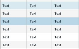
Grids should use alternating row colors to drive home the atomic nature of the information contained therein.
-
Minimize the need for users to remember things.
-
If the user needs to know several items of information in order to make a decision or perform an action, display all the necessary information simultaneously with the choices for action.
-
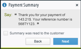
Error messages and other alerts should restate the context of the error or situation, that is, what is wrong, what has happened, etc.
-
Confirmation messages should restate what action was requested and completed.
-
-
Alignment rules below assume a left-to-right language.
-
Labels relative to their control:
-
Labels should be above the control if you have enough vertical space.
-
Labels should be right-aligned to the left of the control if vertical space is at a premium.
-
-
Vertical alignment of text, graphics, and controls comprising a line/row should be by the baseline of the first line of text (if there is wrapping).
-
Dialog buttons at the bottom of a dialog should be right-aligned.
-
Text in grids:
-
Heading alignment should always matches the alignment of the column values.
-
Text columns should be left-aligned. Text includes alphanumeric strings intended not to be interpreted as quantities, such as a serial number.
-
Numeric columns should be right-aligned.
-
-
Page, dialog, and section titles should all be left-aligned.
-
Fitt’s Law
Paul Fitts described a way to mathematically predict how long it will take to "acquire" a target based on its distance and size. This law states that the time required to rapidly move to a target area is negatively proportional to the distance to the target and positively proportional to the size of the target. Thus, the closer and bigger it is, the faster it is to click on.
Implications for Designers
When applied to interface design, this means that click targets should always be as big as possible, and that action targets should be as close as possible to the means of selecting operands of the action.
Examples
-
Check box and radio button labels must be included as part of the click target, making them as big as possible.
-
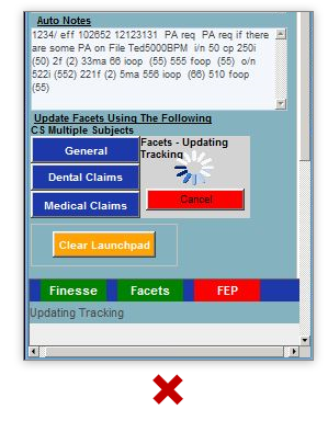
Actions associated with checked items in a grid should appear close to the column of check boxes. This is usually on the “leading edge” of the grid (e.g., the left side for European languages).
Weber’s Law
Weber’s law states that the ratio of the increment threshold to the background intensity is a constant. When you are in a noisy environment, you must shout to be heard while a whisper works in a quiet room. And when you measure increment thresholds on various intensity backgrounds, the thresholds increase in proportion to the background.
Implications for Designers
Weber’s Law means that for a difference to be perceived, the difference must be relative to the current magnitude. This can be used for various sensory modalities in GUIs such as brightness, loudness, line length, visual weight of fonts in typography, color matching, etc. If we think of the visual design of our user interface as that noisy room, we must first strive to keep that room as quiet as possible. Then, when we draw attention to something, or even several things at once, we do not need to shout as loudly.
Examples
Gestalt Principles of Grouping
Gestalt principles of grouping address visual perception. They maintain that the human eye sees objects in their entirety before perceiving their individual parts, suggesting the whole is other than the sum of its parts. The principles are:
-
Proximity
-
Similarity
-
Closure
-
Continuity
-
Common Fate
-
Good Form
Proximity
The principle of proximity states that, all else being equal, perception tends to group items that are close together as part of the same object, and items that are far apart as two separate objects.
Implications for Designers
Straightforwardly, things that are closely associated with each other should appear close together on the screen.
Examples
-
Labels on widgets should either be top- or right-aligned (again, for European languages), keeping them as close to the widget as possible.
-
Information elements that have a strong affinity with each other around an appropriate theme should be grouped closely together, for example, the different text entry fields that comprise an “address” (Street, City, and Country).
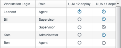
Similarity
The principle of similarity states that, all else being equal, perception lends itself to seeing items that physically resemble each other as part of the same object, and items that are different as part of a different object.
Implications for Designers
When it is important to create the impression of a single unit of elements, or to make elements pop out and become more “discoverable”, we can style the elements the same to achieve this.
Example
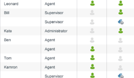
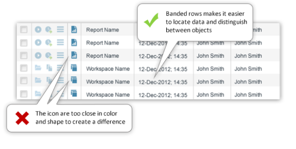
Notice that the grid is much distinct and easier with banded rows, but the similar icons makes it hard to see the difference between “Report Name” and “Workspace Name”.
Continuity
When there is an intersection between two or more objects, people tend to perceive each object as a single uninterrupted object. This allows differentiation of stimuli even when they are visually overlapping. We tend to group and organize lines or curves that follow an established direction over those defined by sharp and abrupt changes in direction.
Implications for Designers
This allows us to be more minimalist with our visual design. For example, do not show dashed lines or the like to indicate the continuation of the edge of a shape when another shape overlaps it.
Example
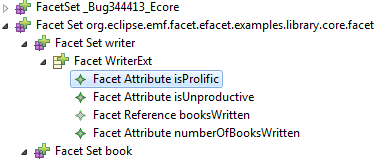
We can easily recognize that the following items are hierarchical. By indenting the objects by level, we can visually show which items are on the same level, etc.
Law of Common Region (Palmer)
Visual items situated together in demarcated (bordered) regions are perceived as belonging together.
Example
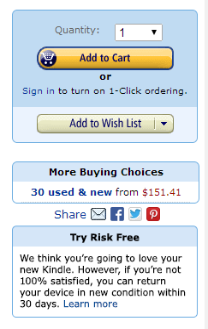
Notice how all the purchase related items are in the same logical and graphical area, the social network items in a distinct row, etc. This makes each component stand out and makes the application easier to use. This also allows developers to decide which parts are more important and to highlight them.
Good Form
The principle of good form refers to the tendency to group together forms of similar shape, pattern, color, etc. Even in cases where two or more forms clearly overlap, the human brain interprets them in a way that allows people to differentiate different patterns and/or shapes. An example would be a pile of presents where a dozen packages of different sizes and shapes are wrapped in just three patterns of wrapping paper.
Implications for Designers
This informs our visual design choices when, for example, several blocks of information exist on a page, each with equal import. We are led to style these blocks identically. Conversely, if there is some hierarchical relationship between these blocks, we would style them differently to call out this semantic difference.
Examples
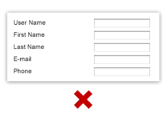
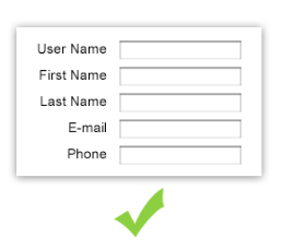
Consistency
Ralph Waldo Emerson said that “A foolish consistency is the hobgoblin of little minds”, and while that is true, there is nothing foolish in minimizing the cognitive load on our users. By being consistent we can reduce the amount of brain power required to parse a dialog or perform a certain task. Users are free to learn a pattern of interaction or the semantic coding of a style once and subsequently just concentrate on performing their task. Imagine how frustrating it would be if every dialog had the OK and Cancel buttons in a different place. Or how visually distracting it would be if each piece of text on the screen was a different font face, size, style, and color? Parsing all these inconsistencies wastes cognitive energy.
Implications for Designers
If you can use an existing template or copy an existing screen, then do it. If you must come up with something new, then make it indistinguishable from what already exists. Your touchstone should be any design pattern library available.
Examples
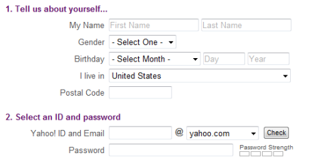
Notice how the use of minimum colors, same fonts and graphic elements, create a simple, friendly and navigable dialog, whereas the use of many strong colors, fonts and positions does not.
Miller’s Law of Short-Term Memory Load
The psychologist George Miller described a variety of phenomenon that suggested that most people can only hold approximately seven chunks of information in their short-term memory at once (the Magic Number 5±2). For example, most people can remember a random seven-digit phone number. Note that Miller’s law does not apply to things like the number of items in a menu or a selection list, because the selection task does not require people to hold the options in memory.
Implications for Designers
This means that we should minimize the memory load of our users by having the system remember and present information where and when appropriate. The user should not be forced to remember information presented on one screen to enter it or search for it on a following screen.
Examples
-
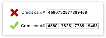
Divide the credit card number (or phone, serial number etc.) into chunks, making it easier to remember and to fill in forms.
-
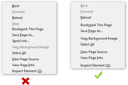
In the context menu, divide the commands into logical sub groups to make the dialog easier to scan and more usable to the user.
Hick’s Law
Hick’s Law suggests that the time it takes for a person to decide depends on the number of choices available.
Implications for Designers
Simplify choices by breaking down tasks into smaller steps and offer fewer choices in lists. Avoid overwhelming users by highlighting recommended options.
Example
If a list is alphabetical and the user knows the name of the command, you may be able to use a subdividing strategy to offer the most popular choices.
Alignment Rules
Rules here assume a left-to-right language.
-
Labels relative to their control:
-
Vertical alignment of text, graphics, and controls comprising a line/row should be by the baseline of the first line of text (if there is wrapping).
-
Dialog buttons at the bottom of a dialog should be right-aligned.
-
Text in grids:
-
Heading alignment should always match the alignment of the column values.
-
Text columns should be left-aligned. Text includes alphanumeric strings intended not to be interpreted as quantities, such as a serial number.
-
Numeric columns should be right-aligned.
-
- Page, dialog, and section titles should all be left-aligned.
References
For further details, see:
http://www.measuringusability.com/blog/hci-laws.php
http://nanlee.wordpress.com/category/theories-in-hci/